Introduction
Flutter Button are basic development components. We usually use them to trigger user’s click events. In Material Design, there are four basic types of buttons:
- TextButton
- OutlinedButton
- ElevatedButton
- ToggledButton
In this tutorial , We briefly introduce the use of four types of buttons.
TextButton
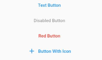
TextButton is a simple text-based button. Previously, Flutter had a button called FlatButton, but now it is recommended to use TextButton. Here is the example:

Example code :
Center(
  child: Column(
    children: [
      TextButton(
          onPressed: () {
            print("button clicked");
          },
          child: Text('Text Button')),
      TextButton(
        onPressed: null,
        child: Text('Disabled Button'),
      ),
      TextButton(
        style: TextButton.styleFrom(
          primary: Colors.red,
        ),
        onPressed: () {},
        child: Text('Red Button'),
      ),
      TextButton.icon(
        icon: Icon(Icons.add),
        onPressed: () {},
        label: Text('Button With Icon'),
      )
    ],
  ),
)
- To show text on button , we need add Text Widget on it.
- We use the onPressed function to trigger user’s action. If set null, the button will be disabled.
- To add style on button, we need custom style function.
OutlinedButton
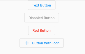
Outlined buttons are medium-emphasis buttons due to the stroke.

Here is the sample code
OutlinedButton(
      onPressed: () {
        print("button clicked");
      },
      child: Text('Text Button')),
  OutlinedButton(
    onPressed: null,
    child: Text('Disabled Button'),
  ),
  OutlinedButton(
    style: TextButton.styleFrom(
      primary: Colors.red,
    ),
    onPressed: () {},
    child: Text('Red Button'),
  ),
  OutlinedButton.icon(
    icon: Icon(Icons.add),
    onPressed: () {},
    label: Text('Button With Icon'),
  )
ElevatedButton
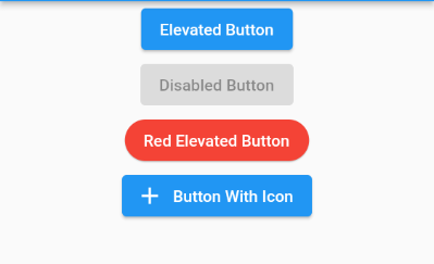
ElevatedButton is a primary button that contains background colors and shadows as below shown.

ElevatedButton(
      onPressed: () {
        print("button clicked");
      },
      child: Text('Elevated Button')),
  ElevatedButton(
    onPressed: null,
    child: Text('Disabled Button'),
  ),
  ElevatedButton(
    style: ElevatedButton.styleFrom(
        primary: Colors.red,
        elevation: 1,
        shape: RoundedRectangleBorder(
          borderRadius: new BorderRadius.circular(30.0),
        )
    ),
    onPressed: () {},
    child: Text('Red Elevated Button'),
  ),
  ElevatedButton.icon(
    icon: Icon(Icons.add),
    onPressed: () {},
    label: Text('Button With Icon'),
  )
- We use the ElevatedButton.styleFrom function to set button style, such as color, shape and more …
- Elevation is the floating height of the button, increasing this value to add shadows and set it to zero to remove them.
ToggledButton
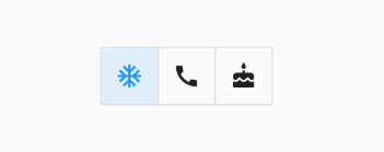
A toggle button is used to change a setting between two states like true or false.

List<bool> isSelected = [false,false,false];

ToggleButtons(
    children: <Widget>[
      Icon(Icons.ac_unit),
      Icon(Icons.call),
      Icon(Icons.cake),
    ],
    onPressed: (int index) {
      setState(() {
        isSelected[index] = !isSelected[index];
      });
    },
    isSelected: isSelected,
  )
- Before the component initialized,we need set a variable list to store status of the toggle button.
- If the button clicked, corresponding state will be set true or false.